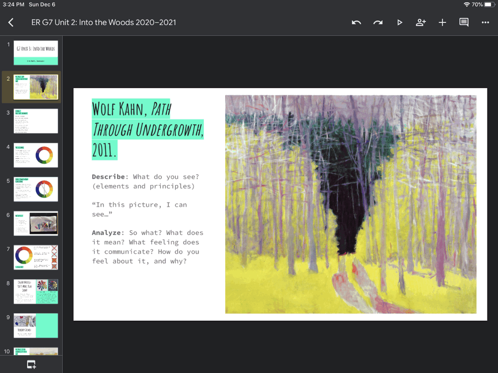
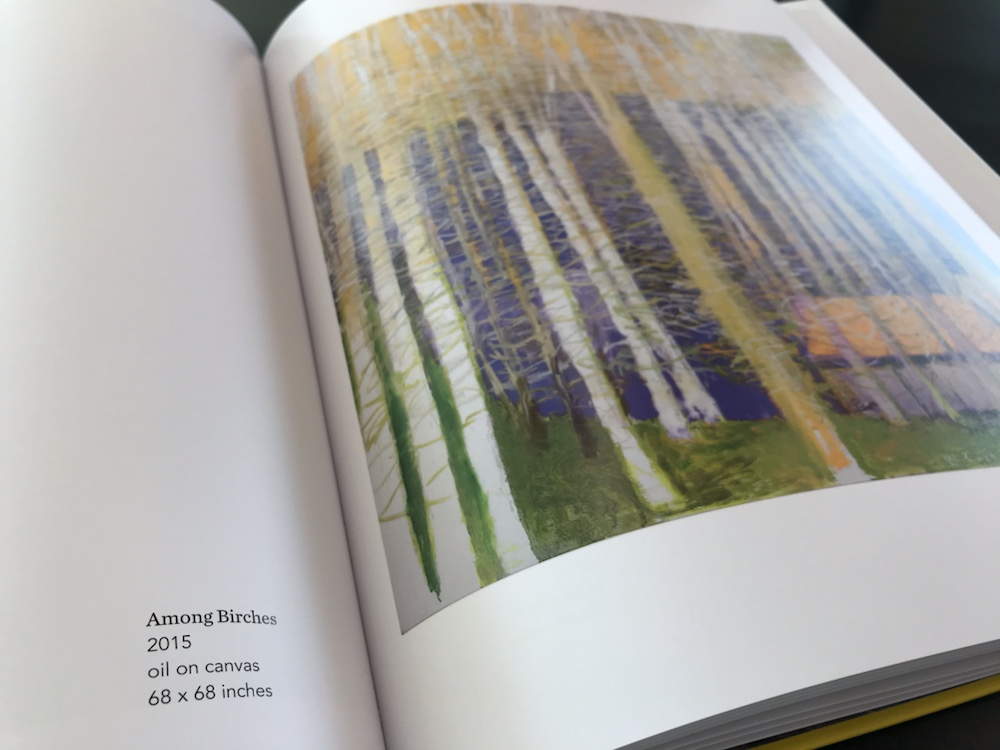
Grade 7 has recently begun looking at the works of German-American artist Wolf Kahn. He was known for his use of vibrant, expressive colors and for his love of landscapes, particularly of trees.
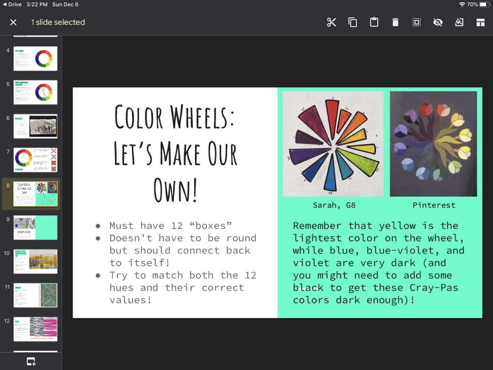
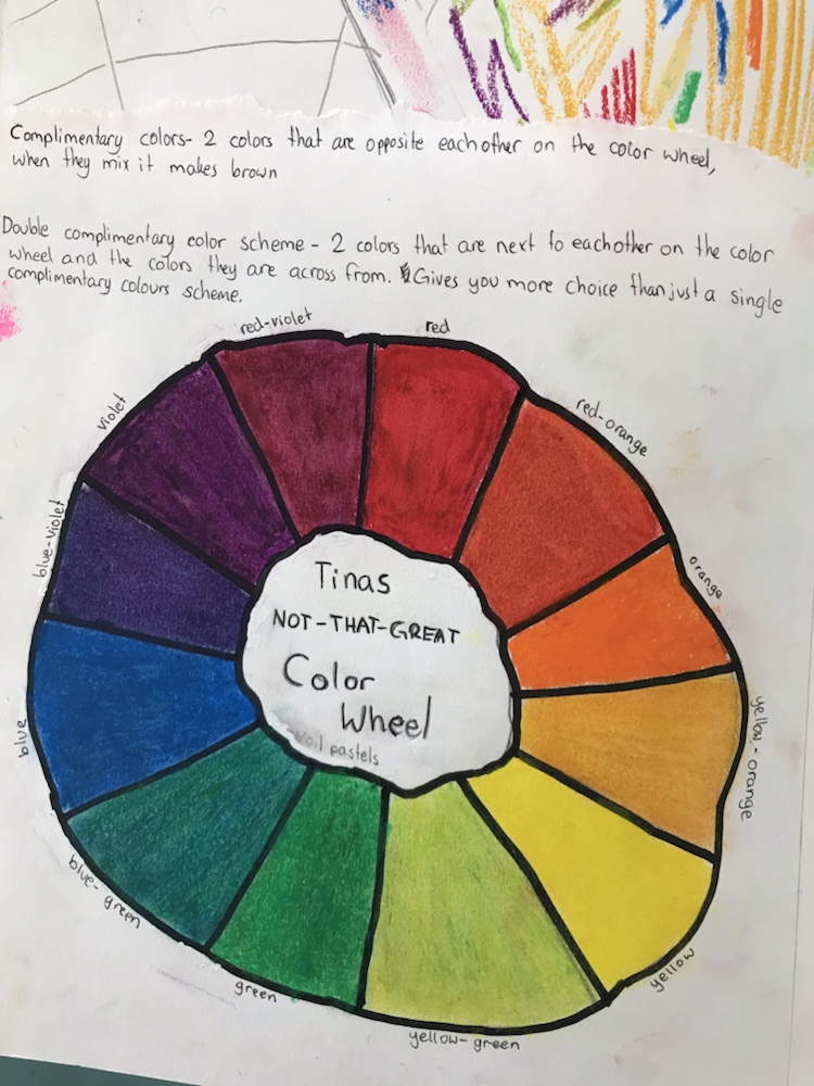
Complementary colors are across from one another on the color wheel, and using them together in an artwork creates a lot of contrast and grabs the viewer’s attention. Many of Kahn’s works feature complementary, double-complementary, or split-complementary colors.
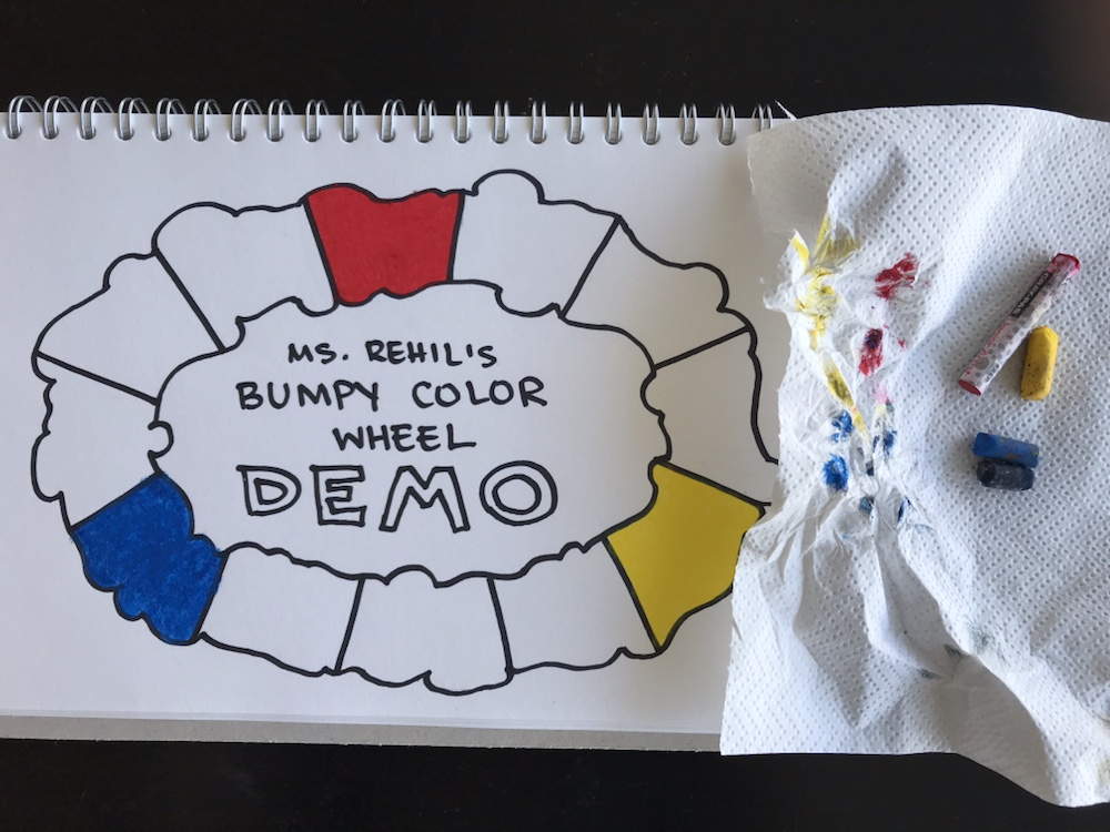
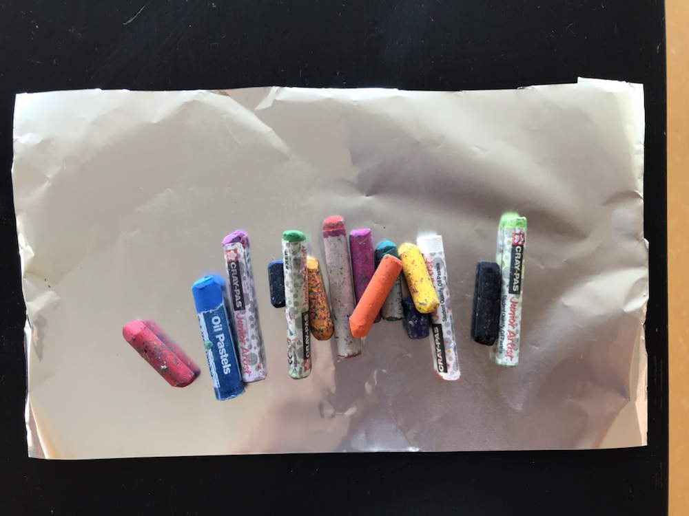
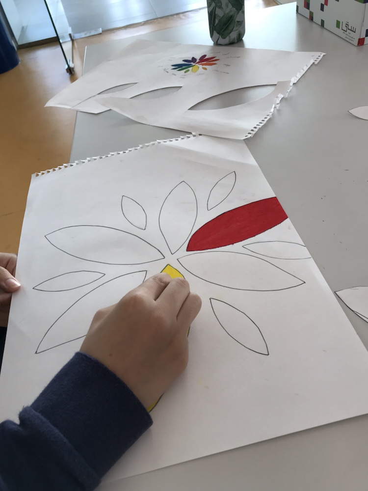
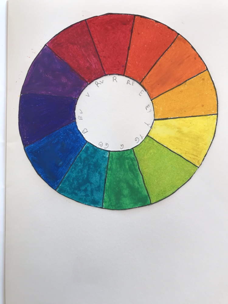
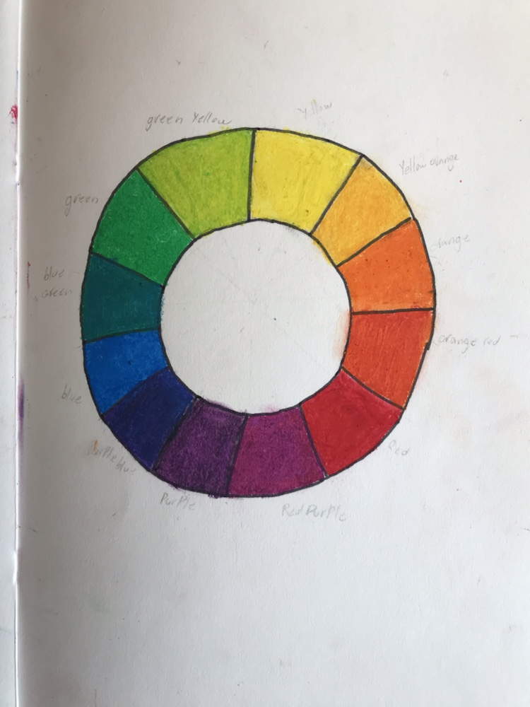
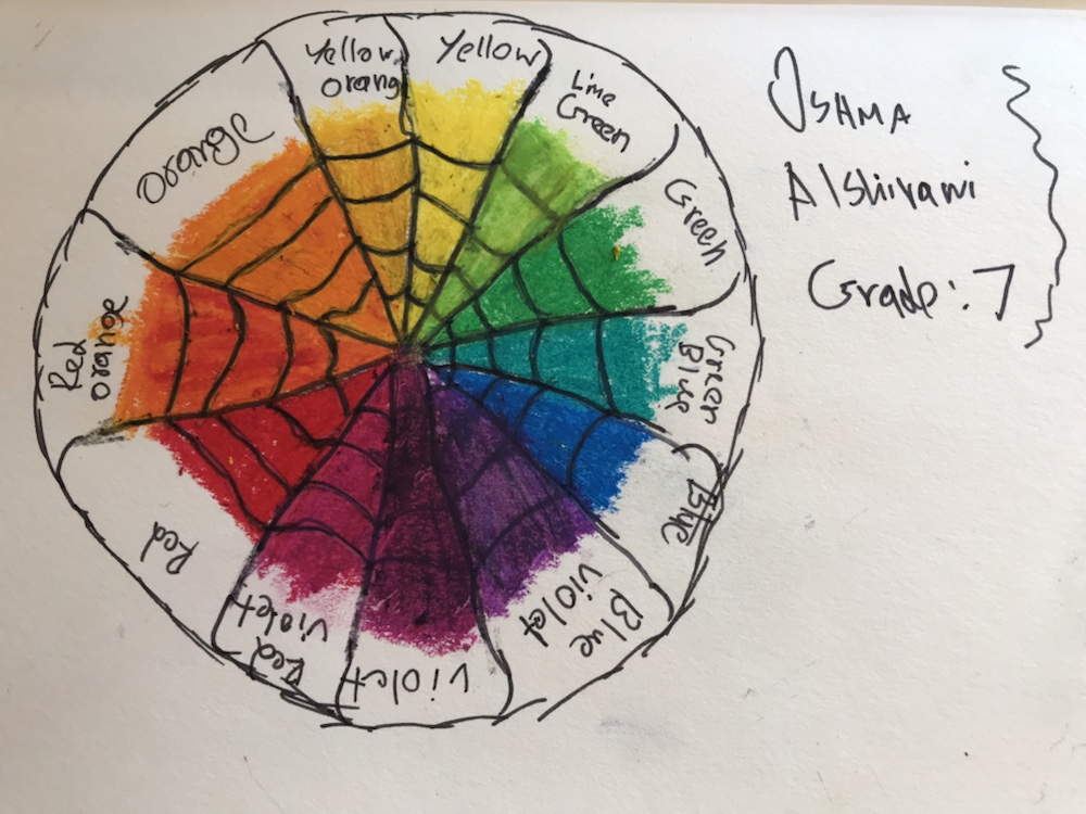
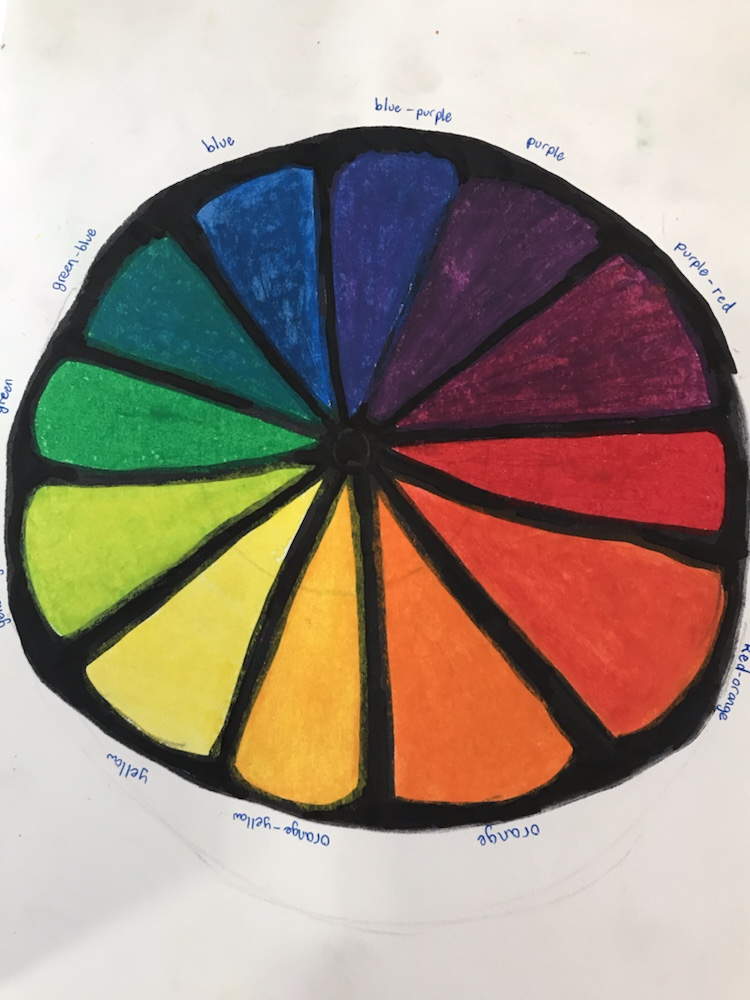
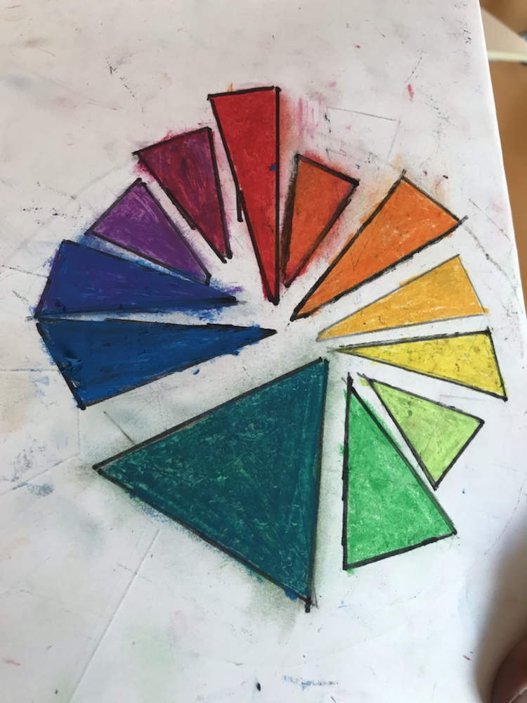
In order to build their knowledge, students are making their own color wheels using oil pastels to mix 12 accurate hues. Those who are working from home are not required to use oil pastels, but they should still work carefully to make sure that yellow is the lightest color, violet and blue-violet are the darkest, and there is a smooth tradition from one hue to the next.
When finished, the class will be able to use these color wheels to help them plan out their color choices for their own expressive landscapes!